do Interiô
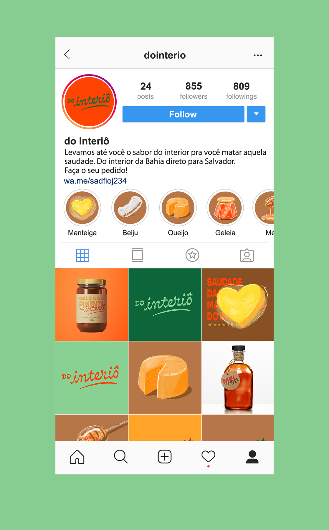
When we move to the big city in search of better opportunities, homesickness begins to grow. To bring a bit of the sensation of being back, do Interiô transports the taste from home to the tables of appartments.
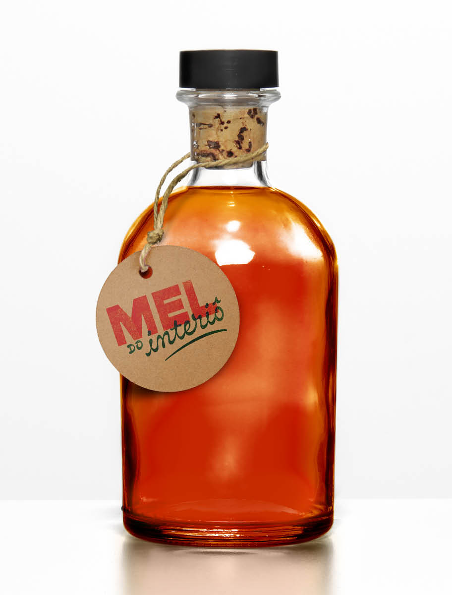
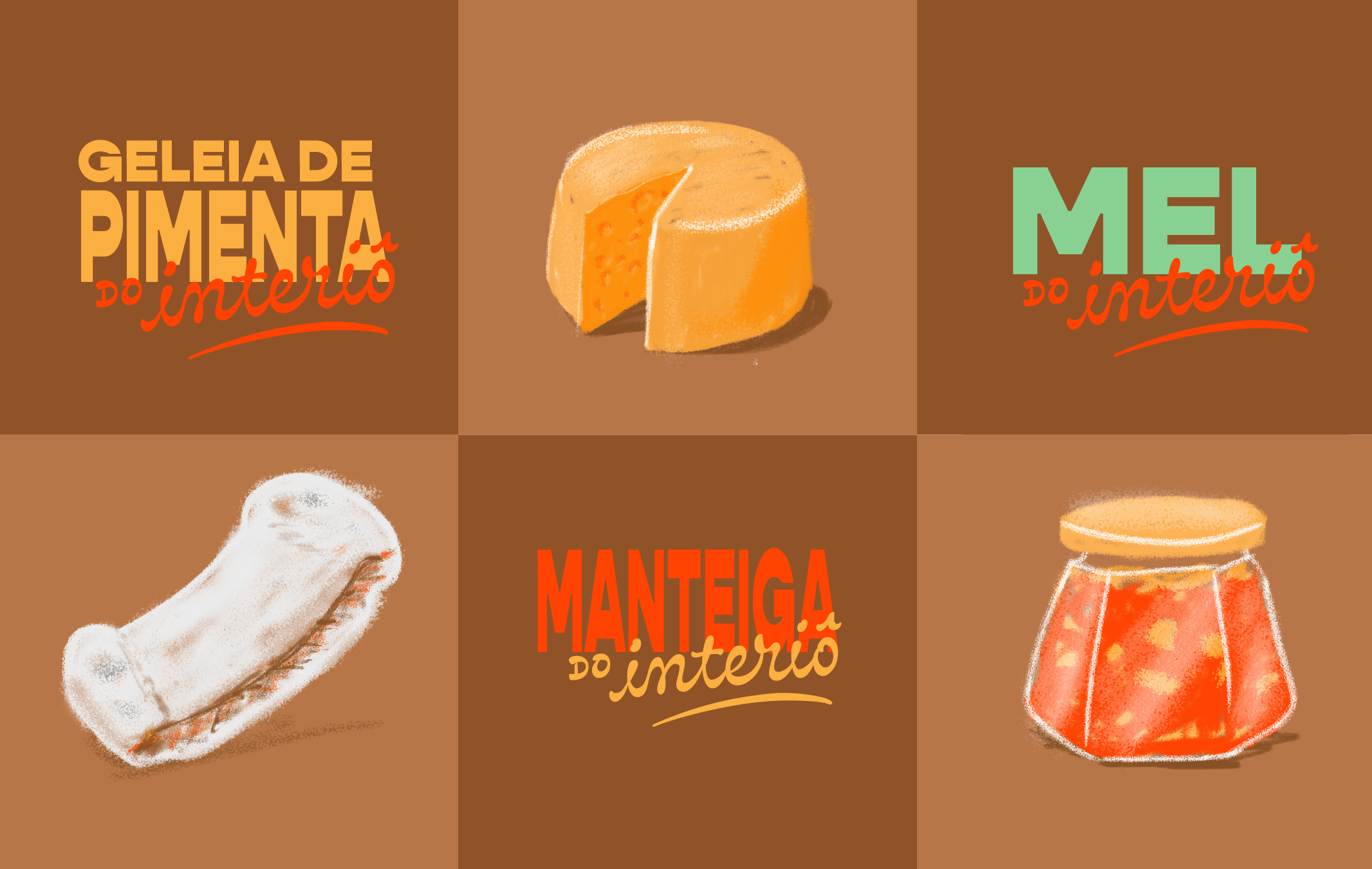
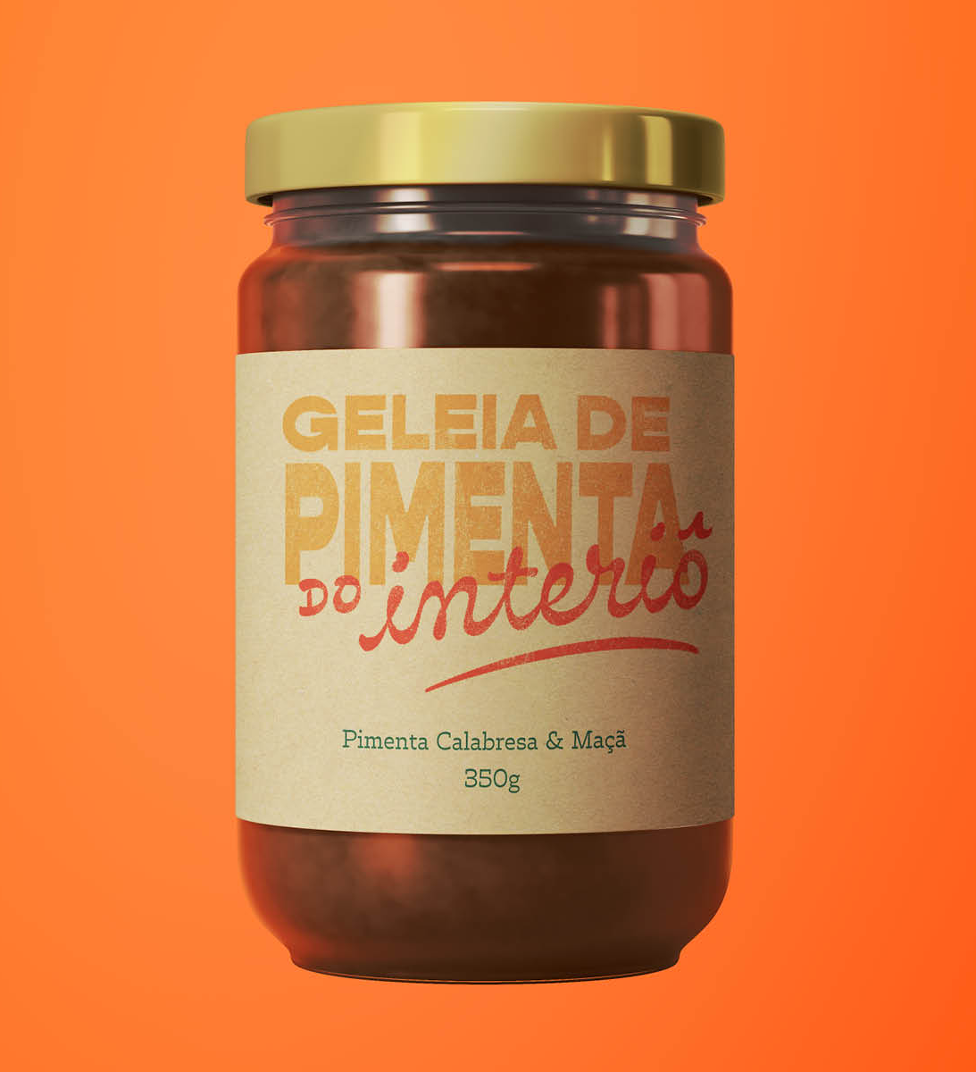
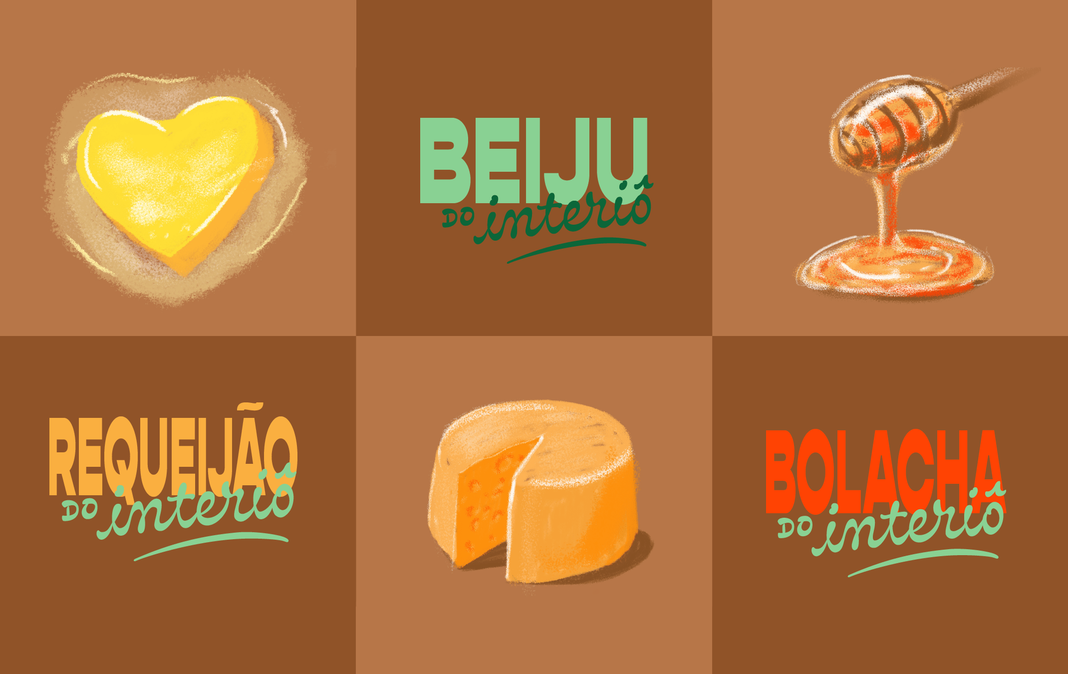
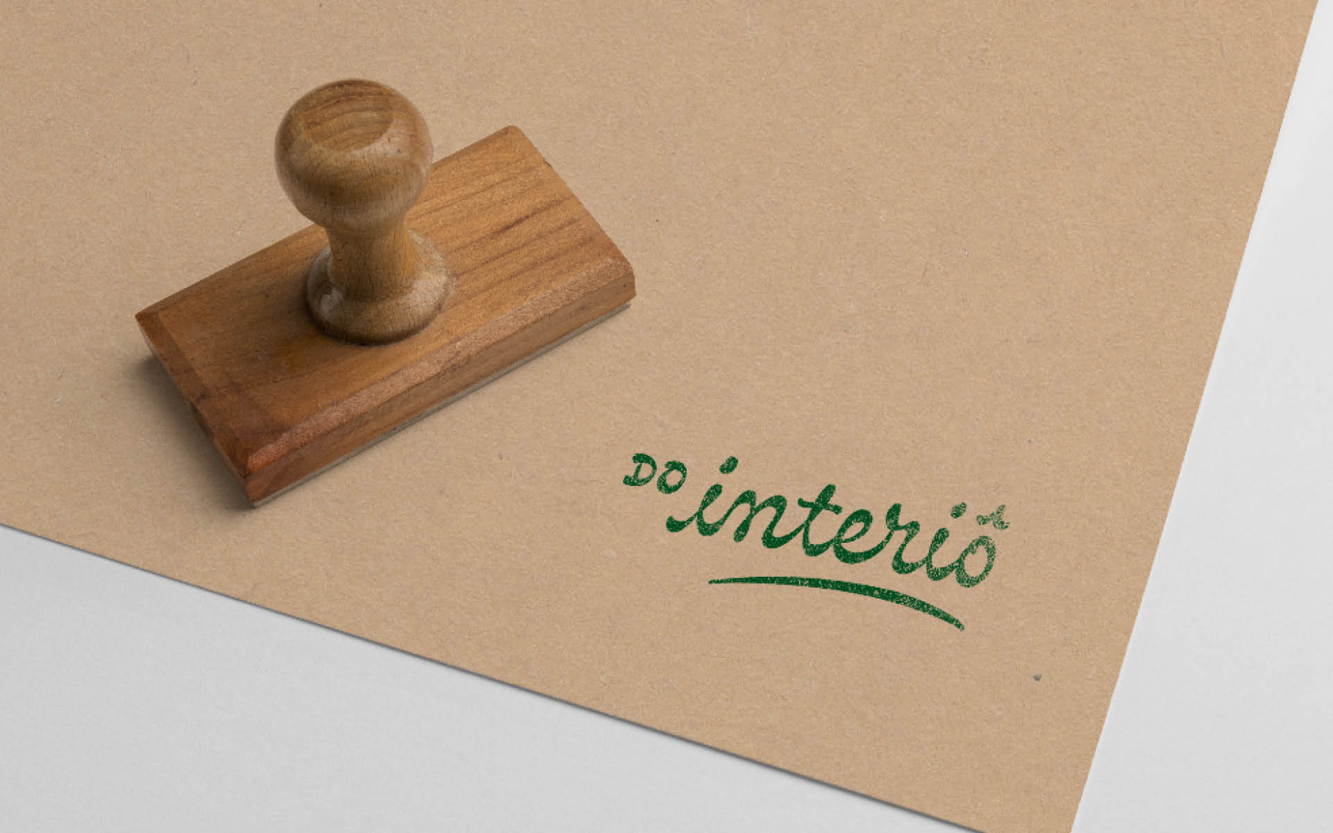
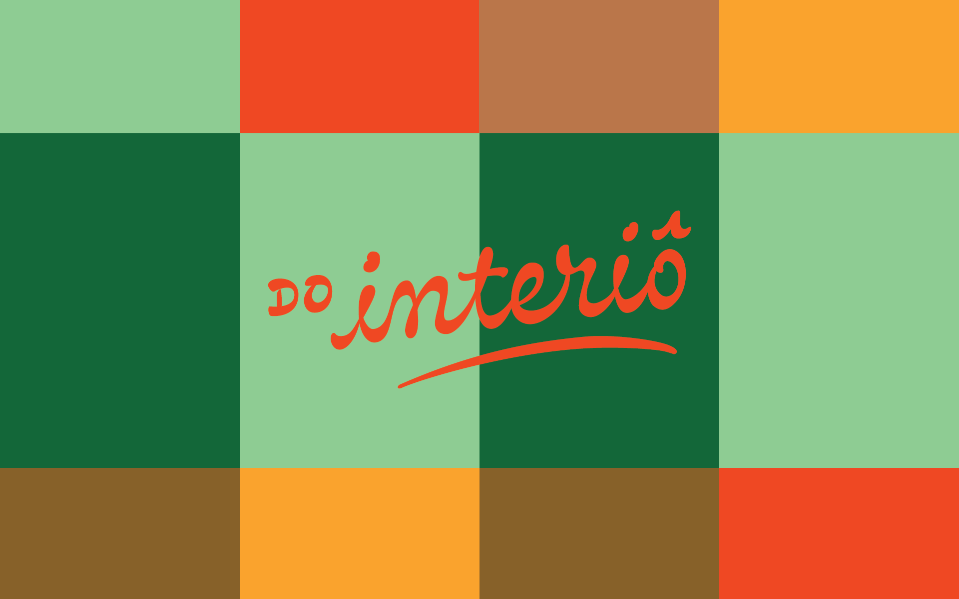
The logotype was draw so to trasmit certain speed and at the same time refer to the made by hand. The inverted contrast of the letters brings a bit of the farm. The font utilized for naming the products contrasts with the cursive logotype. It is stretched and deformed, alluding to folk signs.
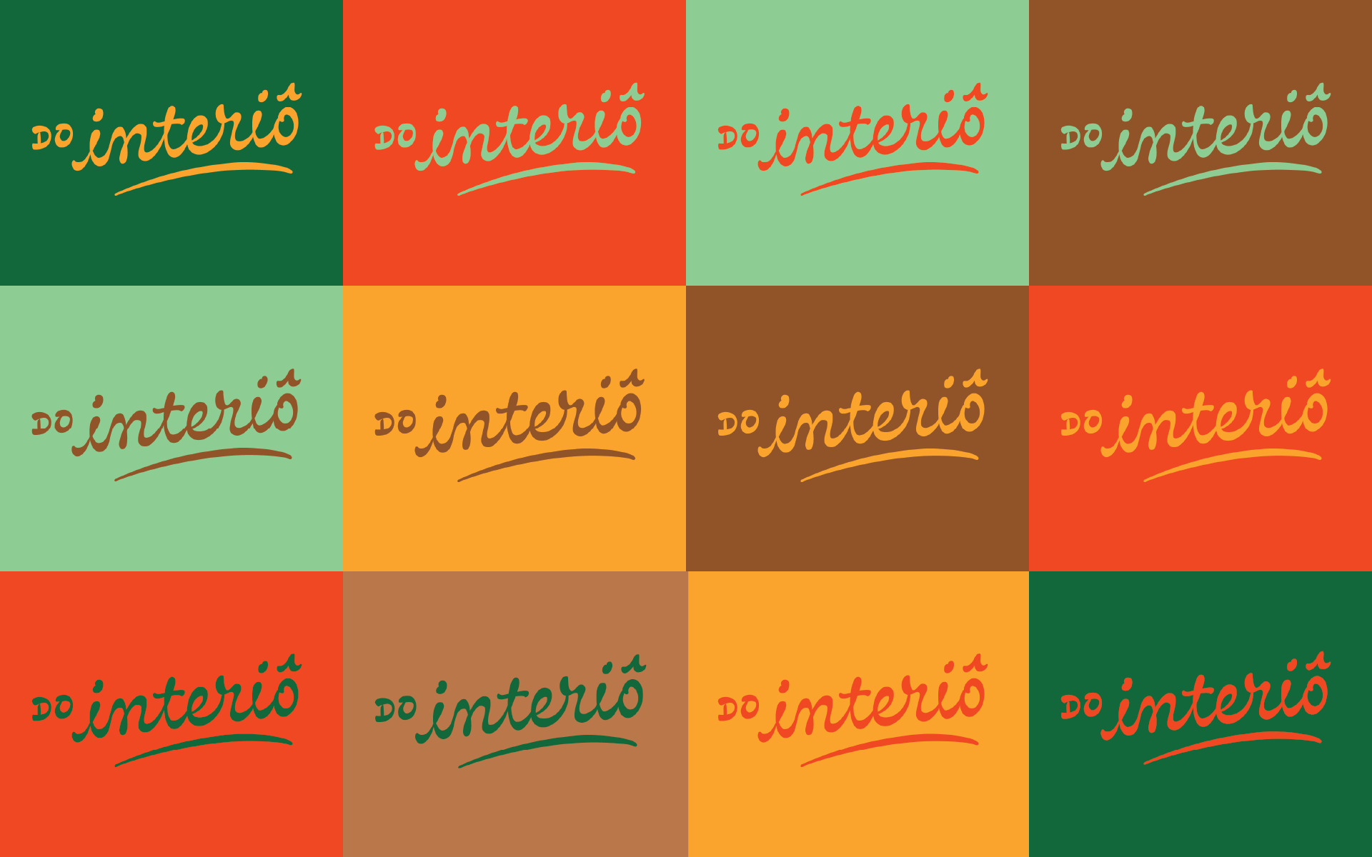
The color palette brings the hues of a farm plantantions, and the yellow and orange complements the greens and browns.
- Logotype
- Visual Communication
- Illustration
- Verbal Communication
PT / EN
